by Ben Harman, Associate Design Director
“Frankensteining” is a fairly common term in the advertising business. Even if you’ve never heard it before, you can probably figure out what it means. It’s used to describe feedback from a client presentation that inevitably goes something like this: you present a couple of options and the client likes these bits of Idea A but those bits of Idea B and that little bit of Idea C and can’t you just mix those bits up a bit? Most of the time the results are a bit ugly, but every once in a while you’re left with something magical. Undiluted transcendence. Flawless fontitude.
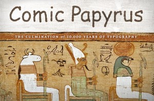
Enter Comic Papyrus. But before I go off on the nubile perfection that is Comic Papyrus, let’s talk about how it was created. Because “Frankensteining” doesn’t really do it justice. The word “Frankensteining” implies dismembered body parts, sloppy lab assistants/interns, pitchforks, and plenty of moaning.
That’s not what happened with Comic Papyrus (except maybe the moaning). You see, Comic Papyrus was a love affair. Not a love-at-first-sight kind of fling, mind you, but one that started timidly with a similar x-height and, through trust, patience, and considerate kerning, finally reached its glorious potential.
 And to think — when I first introduced Comic Sans to Papyrus, I wasn’t sure they’d even get along. Besides their obvious age gap, they had completely different personalities. Papyrus was exotic and excessively proud, spending all of its time at the spa. And Comic Sans frankly lacked the maturity to be in a relationship.
Furthermore, they were both dominant Alpha Fonts, used to sitting alone at the top of the font set. After all, these were the go-to fonts of ace designers and common folk alike. But all this unlikely pairing needed was a little bit of time and proximity. Casually being plopped on top of each other in a Word doc. A few late nights working together on a pitch. And a gloriously breathtaking first date, crammed together on a business card, just millimeters apart and buried deep within the dark musty folds of a gentleman’s wallet.
And so emerged Comic Papyrus. The font to end all fonts, melding the whimsical letterforms of Comic Sans with the timeless texture of Papyrus. Being the literal best of the best, and possessing what you and I can never claim: perfect parents.
Just leave your pitchfork at home.


