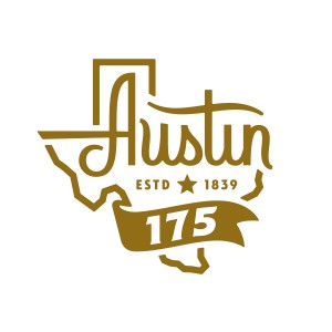
Earlier this morning, GSD&M celebrated Austin’s 175th birthday by unveiling a new logo for the city.
When faced with the daunting task of consolidating all of Austin into a logo, you begin by asking yourself some questions:
When you celebrate 175 years of Austin, what are you celebrating?
What represents Austin?
Is it a place, like Barton Springs? Or an event, like a music festival?
Is it an attitude, like keeping weird? Maybe a bat? Bats are weird.
Austin is the home to so many great things, from UT to F1 … from technology to tacos (to traffic).
But it’s not really about what represents Austin – it’s about what Austin represents. And Austin represents Texas. Austin is Texas.
If any city is deep in the heart of Texas, it’s Austin. Geographically. Politically. Emotionally.
So we developed this word mark that intertwines the letters in Austin with the shape of the great state itself, merging the two together. So even when the logo is just an inch wide, you’ll be reminded of all that Austin is. And all that Austin can become.
Then just pump your fist a bunch, make your glorious stallion rear up, and ride off in a cloud of taco dust.*
*There’s no such thing as taco dust as far as I can tell.
Want to purchase a limited edition t-shirt featuring the new logo? Email apf@nullaustinparks.org.


