And so another year of SXSW has come and gone. We here at GSD&M find ourselves reflecting on all of the great music artists that graced our backyard, hallways and our hearts. Sometimes it’s hard to imagine we call this place work.
To commemorate all of the wonderful sights and sounds, we created individual pieces of art for every artist to sign for the agency and to take home for themselves as well.
There were no boundaries to this project except to have each designer visually create their own interpretation of the artist they were assigned.
Here’s a look into the inspiration behind some of the artists’ respective pieces:
Laura Guardalabene, Jr. Designer (Eliot Sumner)
“Much of Eliot Sumner’s dark electro-rock tracks have an angsty sadness to them while remaining uptempo and danceable. She has an androgynous, masculine tone to her voice and often sings about relationships, sexuality, uncertainty and alienation. Sumner doesn’t identify as any gender and is part of the current gender fluidity movement. This poster represents intertwining genders and breaking traditional hetero-normative barriers. It plays with masculinity and femininity by juxtaposing soft fluid shapes with angular geometric forms. There is inherent tension to the piece and at the same time balance to it.”
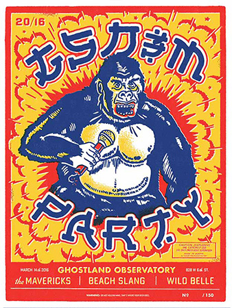
Ben Harman, Assoc. Design Director (Ghostland Observatory)
“After a few years on hiatus, Ghostland Observatory would soon be headlining our annual GSD&M party during SXSW. After considering various visual elements to include in the design, we decided on the following: an abstract phoenix rising out of the dust to symbolize Ghostland’s reemergence into the music scene; a modernized Native American illustration style and color palette, reflecting the stylistic influences of lead singer Aaron Behrens; and lasers (an essential part of any Ghostland show).”
Summer Ortiz, Studio Artist (The Heavy)
“The Heavy’s music is energetic and fun and felt very colorful to me. The band seems to have cultivated a really cool, vintage-inspired style, and I wanted to incorporate both those elements into the poster I made for them. I came up with the idea of a colorful, fun house party scenario just waiting for them, existing in contrast to the quiet, muted surroundings.”
Adriane Joseph, Presentation Production Artist (Joseph)
“Joseph is labeled as ‘dark, folk-pop.’ Their style conveys a sense of feeling most at home when surrounded by nature up in the Pacific Northwest, where the three sisters who make up Joseph are from. Their sound is folksy and delicate with a subtle haunting vibe. For these reasons I was drawn to the idea of an overgrown forest floor with the band’s name carved into a tree. The colors are earthy and muted with pockets of pink and yellow to add just a touch of femininity.”
We had all different kinds of creative cloth pitch in, and in the end, it left us with 13 wildly different directions of visual thought. That’s the beauty of music and art—they’re always in bed together. Giving you either adoration for the ear or love for the eyes.
A quick shout out to all of the artists that made this project possible and such a success. Thank you.
Summer Ortiz, Studio Artist
Frank Benavides, Creative Intern
Laura Guardalabene, Jr. Designer
Steve Wolf, Designer
Adriane Joseph, Presentation Production Artist
Greg Thomas, Designer
Dustin Coffey, Assoc. Design Director
Ben Harman, Assoc. Design Director
Ryan Warner, Art Director